2022 Web Design Trends

by | Feb 28, 2022 | Graphic Design

  1. Home
  2. Graphic Design
  3. 2022 Web Design Trends

We believe everyone can agree that the past few years have been manic. However, it’s now 2022, and it is time to look to the future. This article will explore the most prominent trends sure to come up in web design in 2022. Traditional web design just isn’t good enough anymore, trends are essential to stay on top of capturing your audience’s attention online. Perhaps one of the ideas below can spark your interest!

Who Needs a Website the Most?

Quickly, before discussing 2022 web design trends, what businesses actually need a website? Generally speaking, pretty much every business needs one! Regardless of your industry, a website is vital to market what you are trying to sell and reach a wider audience. Here are some examples of businesses that need websites:

E-Commerce

This category can include many different types of business, such as clothing, manufacturing, and agriculture. Online companies must have a website to sell any products. The only way to survive as an online business nowadays is to keep up with competitors and get what you’re selling out into the world for people to see!
2022 Web Design Trends for e-commerce

Government and Organisations

In the past, the only way to learn about government grants was to watch TV or browse the government website. Nowadays, people watch streaming rather than live TV, and the UK government website contains a great deal of information, so sometimes it can be challenging to find what you’re looking for.

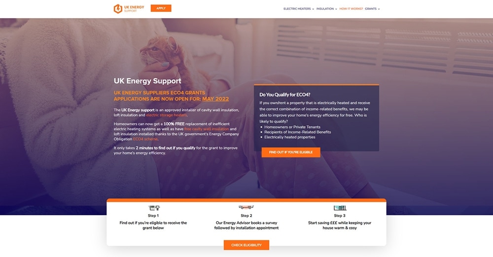
Nowadays, some companies specialize in providing access to specific government schemes, such as grants for house repairs or information on which benefits you may be eligible to receive. Thanks to their user-friendly questionnaires designed with User Experience (UX) in mind, they make it easy to identify which government grants you qualify for.
UK Energy Support

Niche Businesses

Suppose you consider yourself a unique business with unusual products to sell. In that case, your client base may be smaller than others, and you need to convey a clear message when addressing them online. A website is a perfect place to do that! By having your business online, you can reach a wider audience and find those customers who will appreciate your work, no matter how niche.
Creative 2022 Web Design Trends ideas

Food Industry

You have a fantastic restaurant, but how will they know if people can’t find you? Customers often search for new restaurants online, and if you have no online presence, they don’t know you exist. A website showcasing your restaurant and the fantastic food you make can entice people to visit you – and the better your web design, the more people will continue to explore your website – that’s why you need to look at the 2022 web design trends!
Creative 2022 Web Design Trends for the food industry

Hospitality

Just because you are not an e-commerce business doesn’t mean you can escape the online marketing required to keep up with competitors. Having a physical building, such as a hotel, does not mean customers will flock to you when they have no way of finding you online first. Word-of-mouth was great a while back and is still applicable now, but it is just not good enough in this modern age with the internet at people’s fingertips. Having a website in the hospitality industry is as vital as any other industry when showing what you offer clients.
Creative 2022 Web Design Trends for hospitality businesses

Other business examples that websites are helpful for can include:

  • Electricians
  • Estate agents
  • Counsellors
  • Accountants
  • Mortgage brokers
  • Authors
  • Artists
Anything under the sun that sells products should have a website in 2022 and follow web design trends! Despite the modern no code platforms available now, web development is a tricky task and tough to stay on top of, especially with the different interfaces required for mobile devices. If you don’t know where to begin creating a website, you can always contact us for help! A web designer might be just what you need.
Creative 2022 Web Design Trends

What are the Current 2022 Web Design Trends?

Now onto the real subject of this article! You are a business, any kind of business, yet your products or services just aren’t selling. A big problem you may be facing could be a lack of a website page. Worse, you have a website, yet people just are not looking at it. Having a website with stunning web and graphic design makes you far more likely to keep a customer exploring your page and products out of interest. However, you also need a design that shows off your unique brand identity. Let’s look at the most significant 2022 web design trends you might consider.

Horizontal Scrolling

The vast majority of websites of the years have had a vertical navigation system, but that’s no longer the case with the latest web design trends! A side scroll layout is now a hot trend being implemented by many web designers to catch the eyes of potential customers. It is handy for websites that need to showcase portfolios, maps, or catalogues so people can discover your products quickly in a more engaging way.
2022 Web Design Trends Horizontal Scrolling
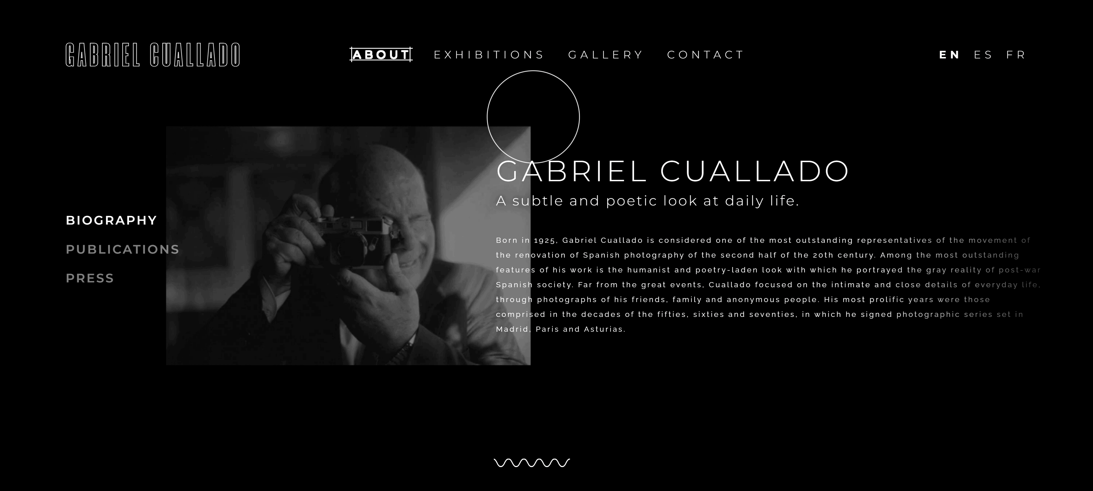
Gabriel Cuallado’s website is a beautiful example of horizontal scrolling. Not only does he have a bold, eye-catching monotone colour scheme, but you are also further drawn into staying on the website with how the information scrolls horizontally across the screen. Even when scrolling through the text, not everything moves at the same speed, making for an interesting visual effect while navigating the page. It is jarring having something unusual happening online, so surprising a website visitor with new visual interest could attract them to stay and explore your website if you implemented this web design trend.

Nostalgia

This 2022 design trend isn’t new, as it has been popular for the past couple of years. Some trends are just seemingly timeless! Since covid-19 hit, people wish to reminisce about the past, so offering a comforting user experience while navigating your website could attract them to your products. Often websites in this category consist of retro fonts, more texture and graininess, softer lighting and colour palettes, and classic image filters.
2022 Web Design Trends Nostalgia
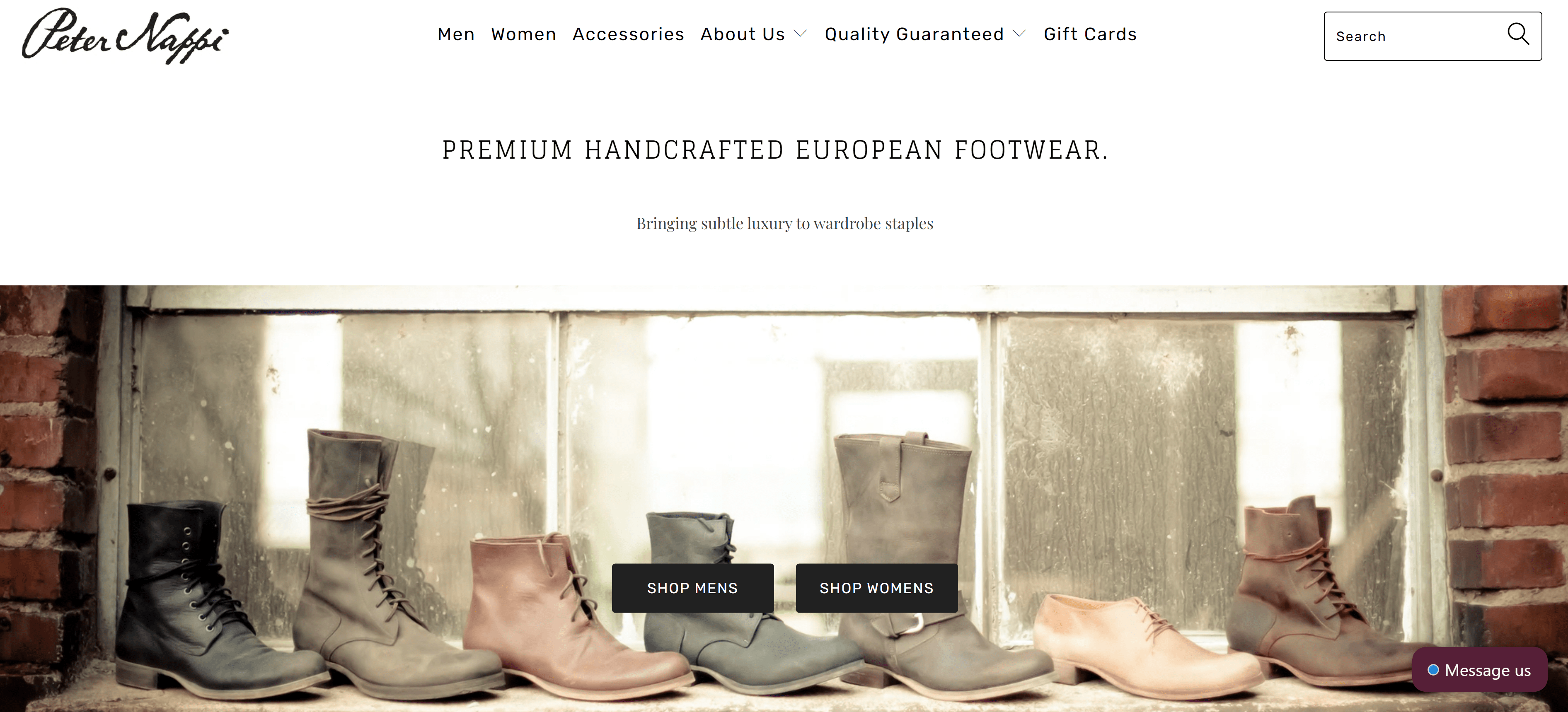
Peter Nappi Studio is a lovely example of nostalgia harnessing to show their products. They express the subtle and muted colour scheme on the landing page to match the aesthetic of the products they sell, making everything cohesive. The soft lighting and clean design echos times gone by and could attract a customer to look further into what this company is selling.

Contrast Colors

Almost linking to the Nostalgia web design trend, contrast colours on websites is all the rage now too in web design trends. Mainly catering to millennials, this trend echoes the 80s and 90s neon coloured theme. Websites wanting this trend need a vibrant and popping design, with bright contrast and even gradients! Having saturated colours can stimulate viewers to navigate to other pages and discover your products.  No wonder this is one of the top web design trends for 2022!
2022 Web Design Trends Contrast Colours
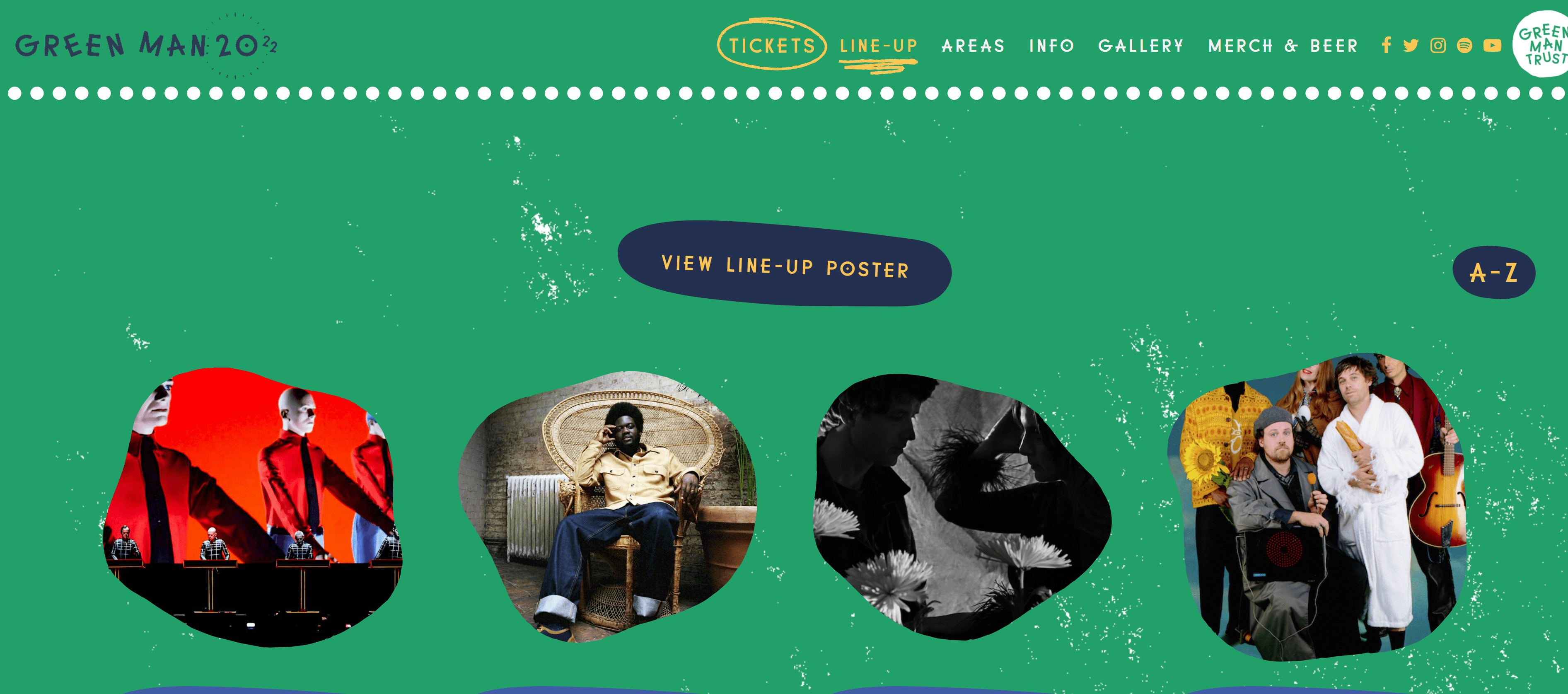
A great example of this can be found on the Green Man Festival website. They have a fun, creative design running throughout their website with bright colours. Contrast colours are used against the background to really make the information pop. This screams millennial design with the lively site illustrations and small animations used.

Inclusivity – The Top of 2022 Web Design Trends
This buzzword is common nowadays, and its ideology should speak to every person. Inclusion hasn’t always existed, yet the strategy makes people want to delve deeper into what’s on offer in today’s market. An inclusive design is challenging to accomplish and affects every part of the web design process. Decisions on your target audience, personalisation, tone of voice, graphics, and colours all need to be reflected in the web design to capture customers’ attention. Your brand needs to accommodate all people, including their gender, views, situation, and experiences.
An example of this is illustrations and images used on websites now. They appear non-gendered with neutral colours yet still offer a ‘playful diversity’. This can be achieved by hiding the gender of any models, creating a gender-fluid display, attractive to all sexes. Lots of inspiration for this web design trend has come from the gaming world, with avatars being showcased and more illustrative figures than real-life models used.
2022 Web Design Trends Inclusivity
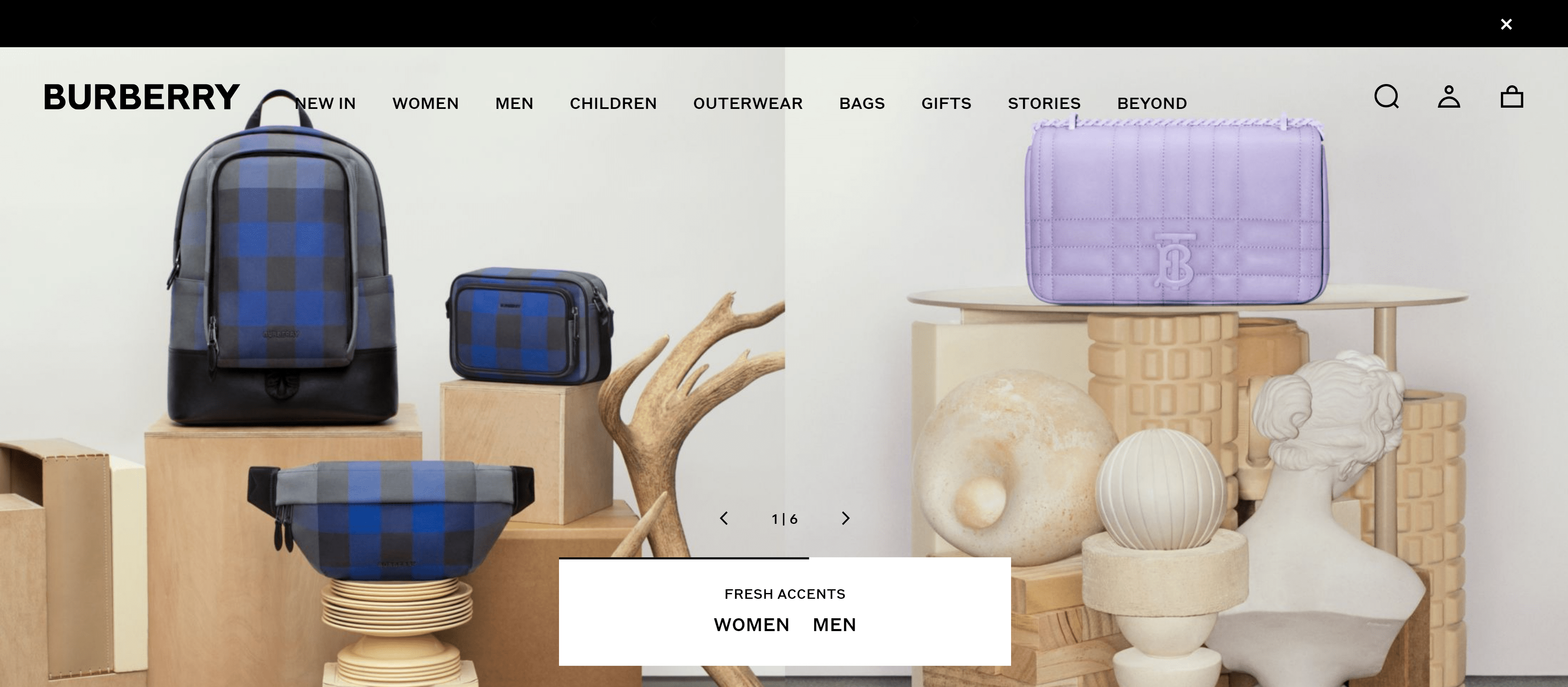
Burberry, a clothing business, is fantastic at carefully curating images to showcase gender-neutral projects and never relying on the stereotypical ‘feminine’ and ‘masculine’ colour schemes such as pink and blue. The soft neutral colours running through their website also allow their products to stand out rather than be distracting with hectic designs and interactive elements.

Oversized Pointers

This web design trend is quite a minor feature of any website. However, it can still pack a punch and interest the person if conducted correctly. As you click through websites, your eye is subconsciously on the pointer at all times. Hence, you know where you are navigating to a website. Yet, they are often small and inconspicuous in an attempt to be unnoticeable. However, oversized pointers are now becoming very trendy! This user interface can reflect elements of your product or become more user friendly. An example of this might be that the pointer changes size or colour when landing on particular elements on a page.
2022 Web Design Trends Oversized Pointers
The Pest Stop Boys, a UK-based pest-control company, have a stunning website with abstract illustrations that really uses the new trend of oversized pointers to the max! The fun animated pointer takes up a lot of space and uses the same colour scheme as the rest but inverts it when moving over the area. The innovative use of bug animations running through the oversized pointer is also a great added element to keep viewers entertained while navigating the website while sticking to the theme of services they sell.

‘Brutalist’ Typography

Another of the web design trends, this website design trend is fantastic for businesses wanting to be bold and make their website pop with limited elements included in the aesthetic. The bold typography can be considered as the minimalism when it comes to look of fonts. The polished contrasted look fits in with the modern trends. The brutalist font uses letters as building blocks with neat grid-like lines to keep elements of the website uniform. With the ruled web design, the giant text will stand out to viewers and pique their interest to find out more about your products.
2022 Web Design Trends Brutalist Typography
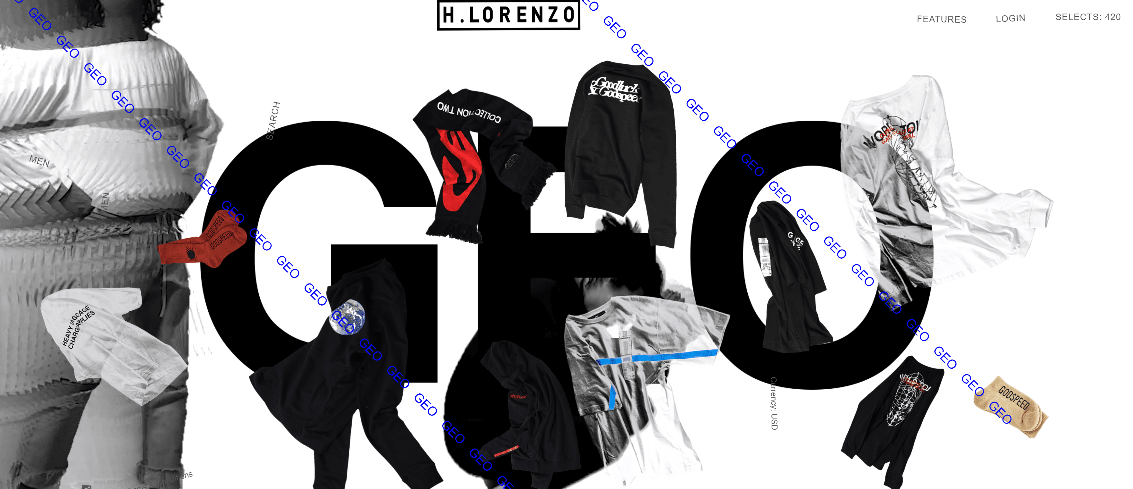
GEO @ H. Lorenzo, another apparel store, couples brutalist typography with animated images moving across the page. There is no mistaking what the business is called. The bold text is front and centre of the landing page, which is exactly what this design trend is meant to accomplish.

Font Animation

While discussing fonts, another web design trend in 2022 is animating them! Also known as ‘kinetic typography’, new techniques are being developed for various interactive fonts and their movement on a website to create a more visually exciting prospect for site viewers. Moving text easily captures the attention of people in comparison to static text.
2022 Web Design Trends Font Animation
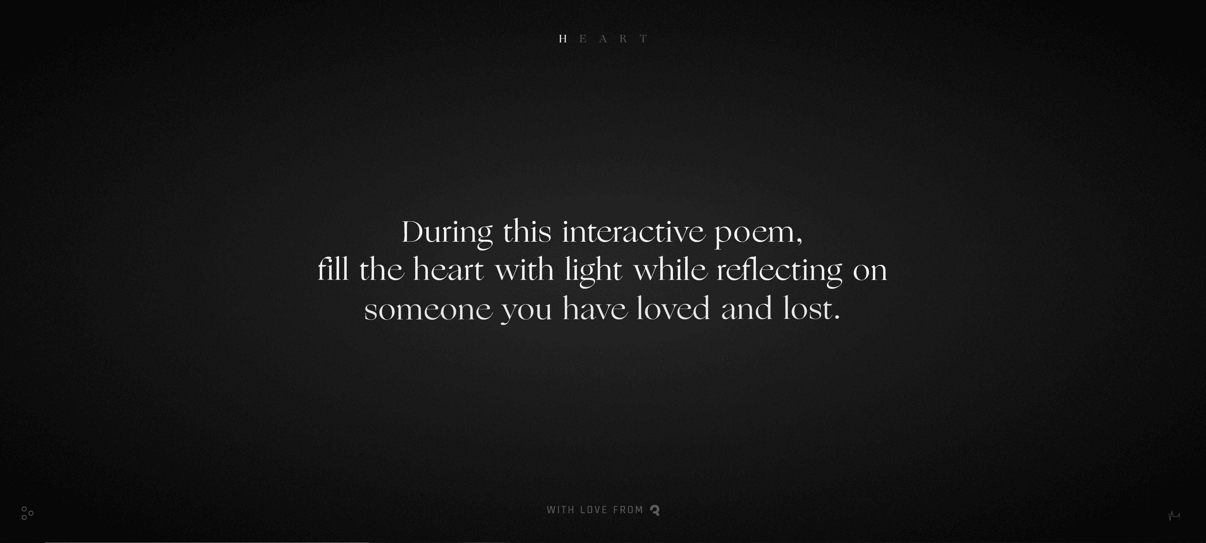
The Love Lost interactive poem from Jam3 is a remarkable example of font animation to entice viewers to stay on the page. The animated text is designed in a beautiful font to reflect the image they want to convey to whoever is reading. They combine many design elements to move between sentences, creating even more intrigue to those navigating the website with all the animated interactive feedback.

Layered Imagery

Trends have focused on a clean and uniform look in the past years. However, in 2022, this is seemingly going out the window! Designers opt for more complex designs, especially when considering imagery on websites. Challenging conventional components such as consistent sizing, aligning images, and precise positioning, layered imagery gives the creative freedom to overlap several images of varying sizes and colour schemes to create a jumble of beautifully immersive elements. This leads people to spend more time on each page to explore the varying imagery and texts that accompany it.
2022 Web Design Trends Layered Imagery
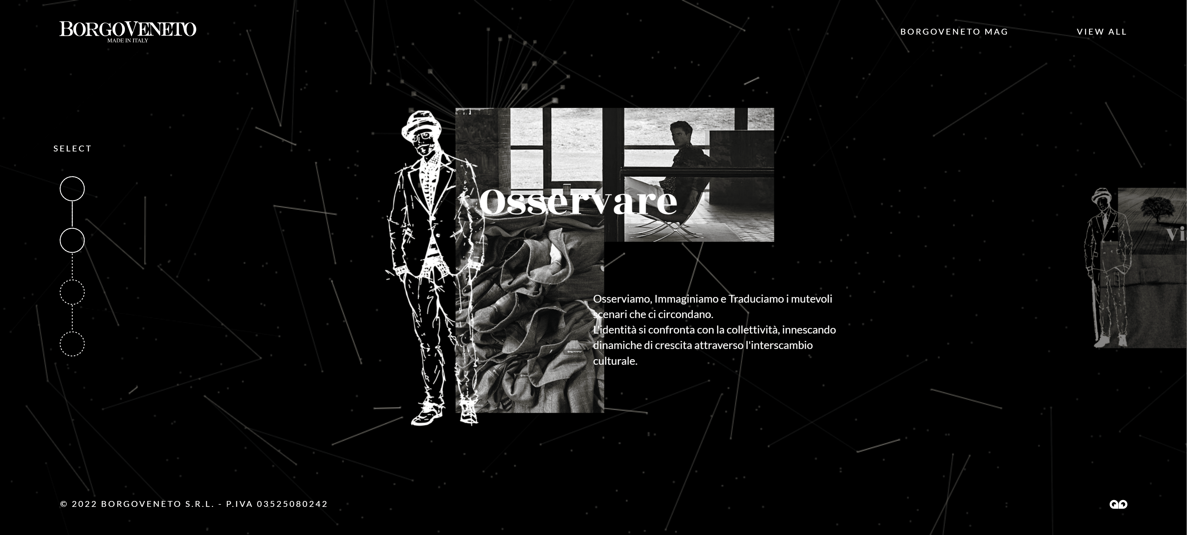
BorgoVeneto somehow combines a clean and minimal look with layered images of different sizes, a moving animated background, overlapping text, and illustrations! The creative freedom expressed in this website is incredible and really draws in whoever comes across it. They achieve this while conveying the message of who they are and what they can provide to their customers.

Fewer Images

On the other extreme to layered imagery is to use fewer images altogether. Some businesses will not match the layered aesthetic, so a more minimalist approach may be required. Keeping things simple can also be more beneficial for customers when they know what they are looking for. The use of colour, typography, and layout can all suggest the identity of your brand ad the products you sell. Some businesses just need to stick to simplicity, especially if that’s what your product is trying to convey. You can communicate your product with less imagery while giving all the viewer information in other methods, like text.
2022 Web Design Trends Fewer Images
A brand that sticks with the minimal approach is Adam Andrascik, a UK-based womenswear brand. One image is shown next to the text, making a simple look and showcasing the product brilliantly. They have cleverly implemented the split-screen use as well. You can see more clothing in any given collection when hovering over the image. This shows that even when you have a lot of products to show off, you can still have a simplistic aesthetic and have fewer images showing at a time.

No Images at All!

Now we are going to the absolute extreme with no images needed on the landing page of your website. Perhaps you think this would be boring? But no hero image could be perfect. Using a different design trick, you can explore the colour palette or typography if there are no images necessary. Other techniques can be implemented to add interest to the page if there are no images, such as animations or other interactive elements. This is an excellent option if you don’t quite have pictures for your business yet! Beautiful handwritten typography in a large font is typical when following this trend. It pulls the page together while still being aesthetically pleasing to the customer.
2022 Web Design Trends No Images
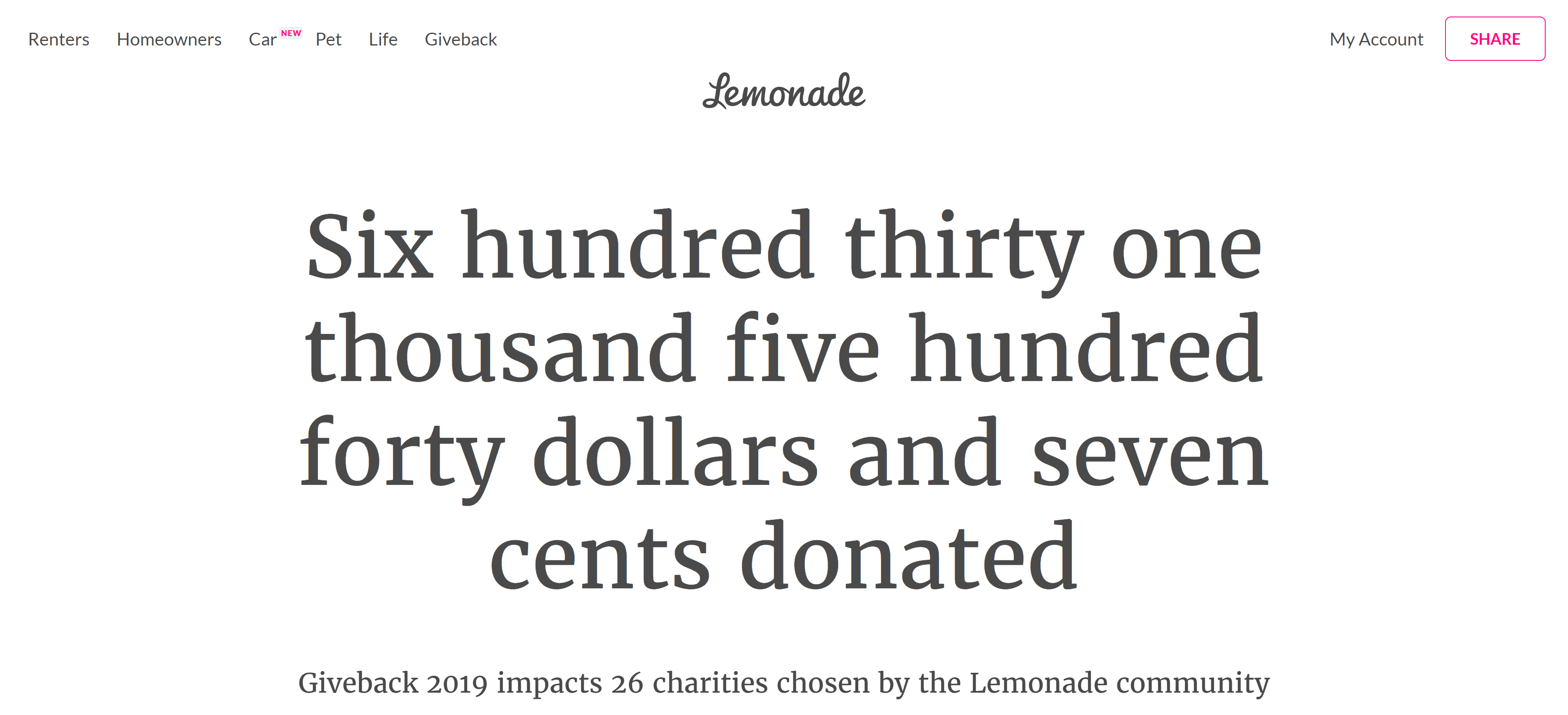
Lemonade, an insurance company, has used this new trend effectively on its website. They use different typography in different sizes to stop it from being monotonous. The interactive elements used while scrolling makes the user want to explore more. They do not use any images on their landing page, opting for exciting text and simple linework illustrations.

The Split-Screen

This web design trend is finally back! It may have disappeared for a few years, but it has come back to the modern web with more creativity than ever. It was initially enacted to enhance user experience, which it still is. Still, now there is also the design and visual aspect of it. The screen could split either horizontally or vertically. Both can have different actions or clickable functions for a more exciting experience. This trend provides a solid and engaging visual experience. It offers multiple entry points into the rest of the website so customers can dig deeper into your content.
2022 Web Design Trends Split-Screen
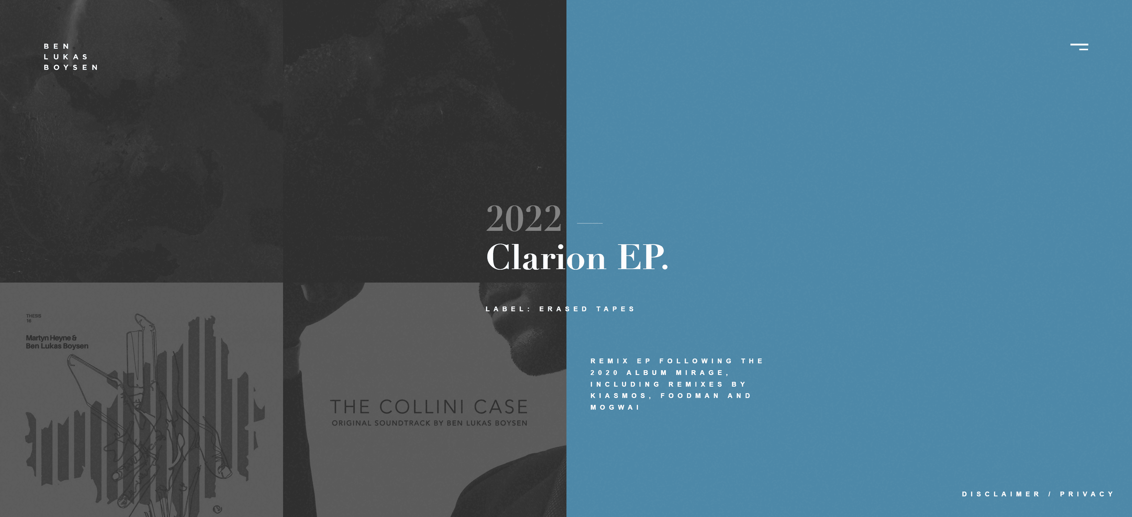
A minimalist approach to the split-screen trend is Ben Lukas Boysen’s website. This German album and audiovisual creator uses the split-screen for aesthetic and informational purposes. The use of the split-screen here allows the website to have a clean look while still providing helpful information. When hovering over the images on one side of the screen, the other side will display information about what you are looking at. This encourages potential customers to continue finding out more about the images shown.

Mega Footers

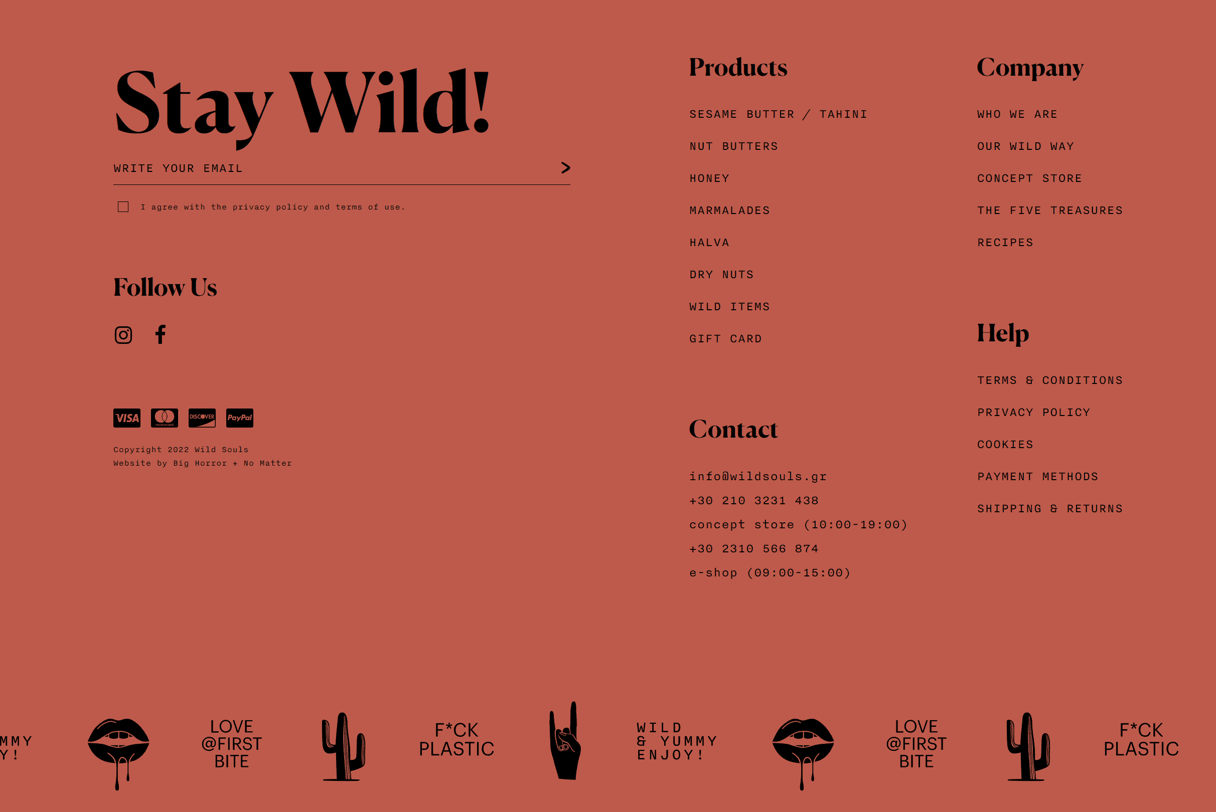
Plenty of people completely ignore the footer unless they search for something particular. In the past, this has led web designers to make fitters as small as possible while still including all the necessary information. Mega footers are becoming increasingly popular and are a must-have element for new websites! There’s the added benefit of having a lot of information to display in them, leading to them navigating to more areas of your website. A thick bar at the bottom of each webpage with multiple organised columns allows viewers to see all options available. You can even plug in your social media sites for extra SEO points!
2022 Web Design Trends Mega Footers
Wild Souls provides an enormous footer at the bottom of their website pages that leads people to all kinds of information they might want to see. The information is laid out neatly, so it doesn’t overwhelm the viewer. Their mega footer has links to everything on their website, which helps people navigate through the site without searching everywhere.

Show not Tell

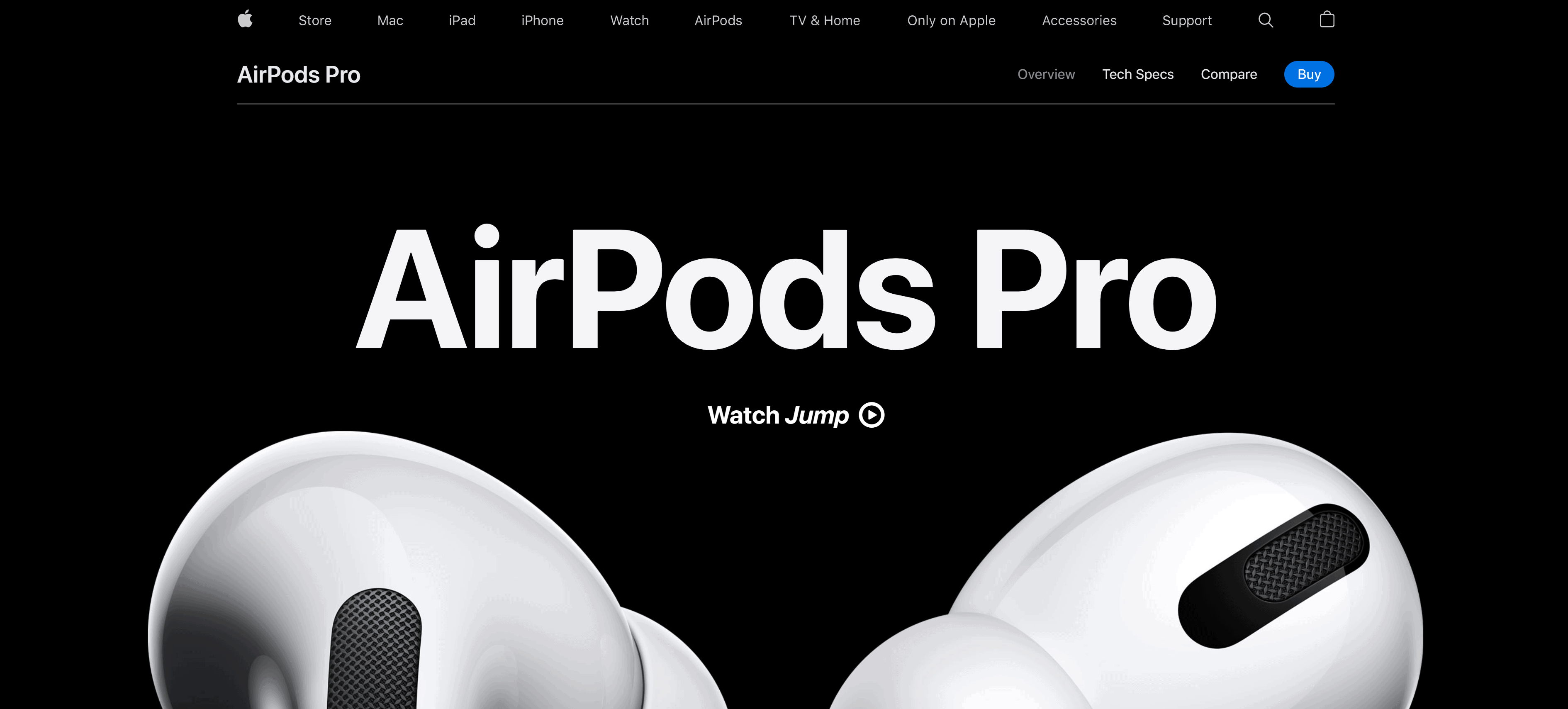
This trend has also been coined ‘scrollytelling’, becoming increasingly popular. It doesn’t seem to be going anywhere anytime soon. This digital interface coveys a story to capture your audience’s attention through narrative visualisation. With a multitude of visual elements strung together and organised chronologically, you can express your message clearly in an intriguing way. This web design allows people to explore your website and the graphics in the structure at their own pace.
2022 Web Design Trends Scrollytelling
Apple is known for their stylish and straightforward characteristic, and so they apply the ‘show not tell’ trend very well. They use a basic monotone design while allowing viewers to watch videos of their Airpods Pro if they choose to do so. They use bold text and high-quality images to keep potential customers interested while showcasing the product as you scroll down. The design gives the viewer more control when it comes to exploring the page as they spread out the information and images, ensuring that people do not receive an information overload all at once, a common mistake in web design that deters potential customers from continuing to view the website.

How Can I Make a Beautiful Website?

As you can see above, there are so many website design trends you can hop on board with for your new website, and it can look amazing. At Colorpeak, we know it isn’t as simple as that. You need a website that emphasises your ethos and showcases your excellent services or products. Some trends simply don’t fit in with specific businesses. Your audience might expect a particular aesthetic that comes with your business that might not match the popular web design trends of 2022, and that’s okay!
2022 Web Design Trends layout
Designing a website is a difficult thing to accomplish, especially with so much competition out there. We need to critique our work honestly and make our websites fit for purpose to engage the target audience. Perhaps one of these 2022 web design trends will be perfect for you and your customer base, but our web design team can help you if necessary. Here, we want to help you see your business thrive with your website and that’s why we create websites for people. We offer many different services for marketing which includes web design. Go check out the rest of our website or contact us now!