The internet kicked off the beginning of the year 2019 with #10yearschallenge. A Majority of social media users began sharing their photos taken a decade ago and compare it with the most recent one, showing how much they have changed. It started on Twitter and soon picked up speed there and on Instagram with thousands of people following the hashtag. But we thought to take another spin and jump in on the 10 years challenge bandwagon comparing how most popular websites in the UK today looked like in the past! So, here is 10 Year Challenge in web design according to Colorpeak’s team.
Google – steady as a rock
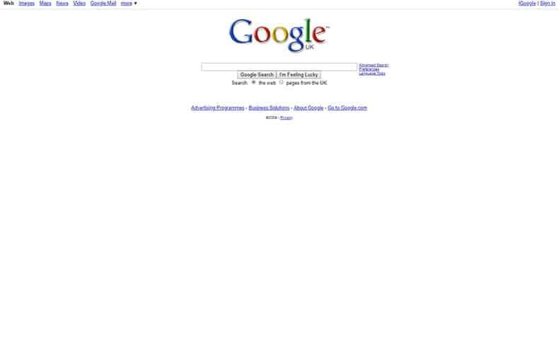
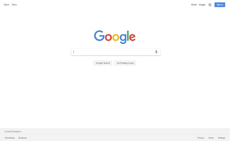
We will start our 10 Year Challenge in web design, of course, with arguably the most important website – Google. And contrary to most of the sites on our list, they have not changed much, at least in terms of grid design. When you go on Google you will be welcomed by a white page with logo and search bar in the middle. And guess what! It was no different back in the days. Most noticeably Google has changed its logo which in 2019 fits into popular flat design trend. The company logo that was in use ten years ago was also the longest lasting up until now (from May 31, 1999 to May 5, 2010). It used serif typeface font called Catull designed in the ’80s.
It seems that Google wasn’t happy with the initial change as the old 20-year-old logo was revamped twice in the last ten years. In 2015 Google finally arrived at what we see today – a geometric sans-serif typeface called Product Sans. The font was created in-house at Google. It’s also worth mentioning that the logo colours, as well as remaining body-font Arial, hasn’t been changed since 1998.
YouTube – ever-changing story
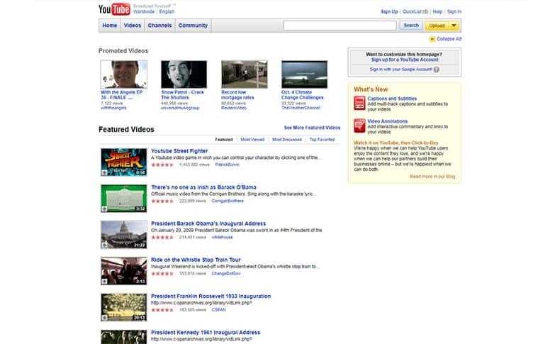
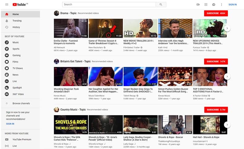
Since YouTube’s acquisition by Google in November 2006, the experiments and testing with the website’s UX and UI began. However, for the longest time, we were just seeing different versions of classic view with the menu at the top, followed by Promoted Videos horizontal panel and the vertical list of featured videos. In 2010 sections “Recommended for you” and “Videos watched now” started popping up. Recommended videos are available to this day, but Videos watched now eventually turned into ”What’s trending”. A side panel menu replaced top one in 2012. In the meantime, YouTube has experimented with newspaper website-like grid showing categories such as sports, music, entertainment and many others. These, however, have come to past.
Current view hasn’t changed much since 2014. We choose whether we want to see the content in a grid or list view. We also saw some minor updates to the side panel menu structure and cosmetic changes to align with modern design.
Facebook – complete revamp, or is it?
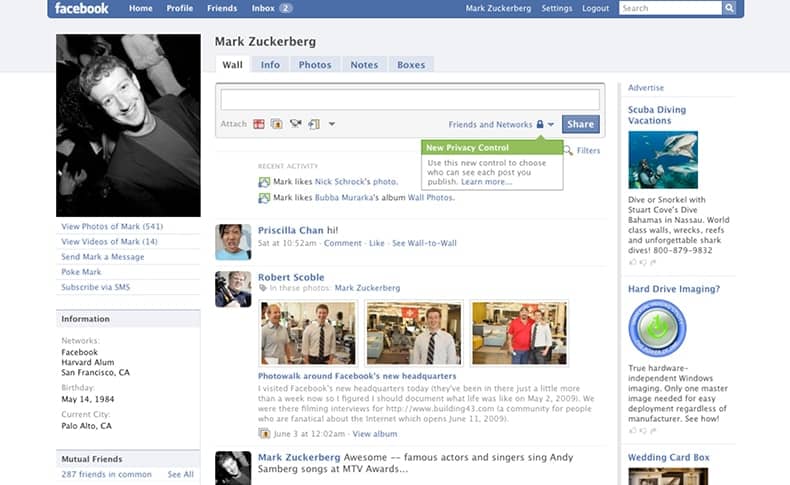
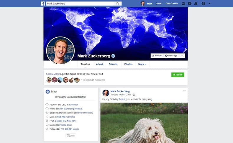
Oh gosh, where do we start Facebook’s 10 Year Challenge in web design? Facebook has changed so much and yet so little over the years. The most noticeable is huge photo replaced by a smaller, round profile picture and a profile banner that now sits at the top of our profile page. However, these days we have a 2-column grid on our profile page (it used to be 3): with left hand-side being filled with our info and the feed filling in the rest. In regards to the page that we interact with on a daily basis, after logging in to Facebook, it remained mostly unchanged with a navigation panel on the left, the feed in the middle and some ads on the right followed by suggestions for people that you may know. Facebook Stories that sit on top of ads panel have only been introduced in 2018, though.
Amazon – knows tricks of the trade
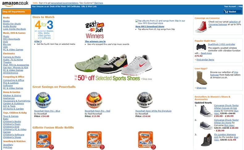
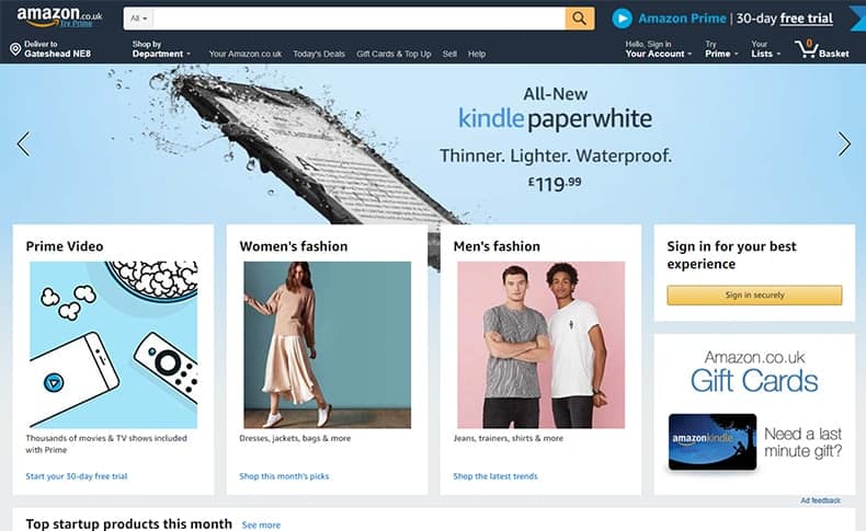
Amazon turned eCommerce selling into art and Jeff Bezos, the owner, to the wealthiest man on earth. The landing page of Amazon has changed quite a bit. We now have access to good old categories on the left side panel as 10 years ago, but they are not available on the Landing page. When you visit Amazon in 2019, you are welcomed by a dark navigation panel at the top of the page allowing you to search for items and manage your account. The rest of the page is covered by a slider that keeps changing showing you the most recent deals in a very pleasing Instagram-like form of large photos with added descriptions here and there. Each slide is different and grabs your attention thanks to significant changes in colour. Amazon seems to know all the triggers that will make you want to purchase something… anything!
BBC – understands the readers
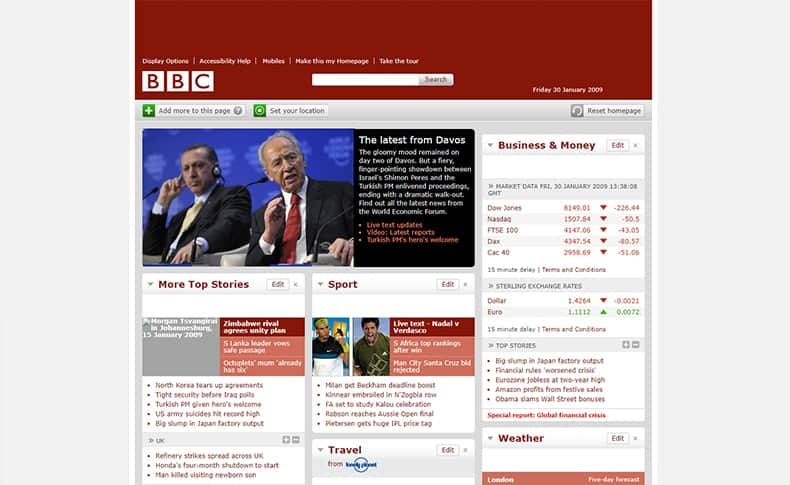
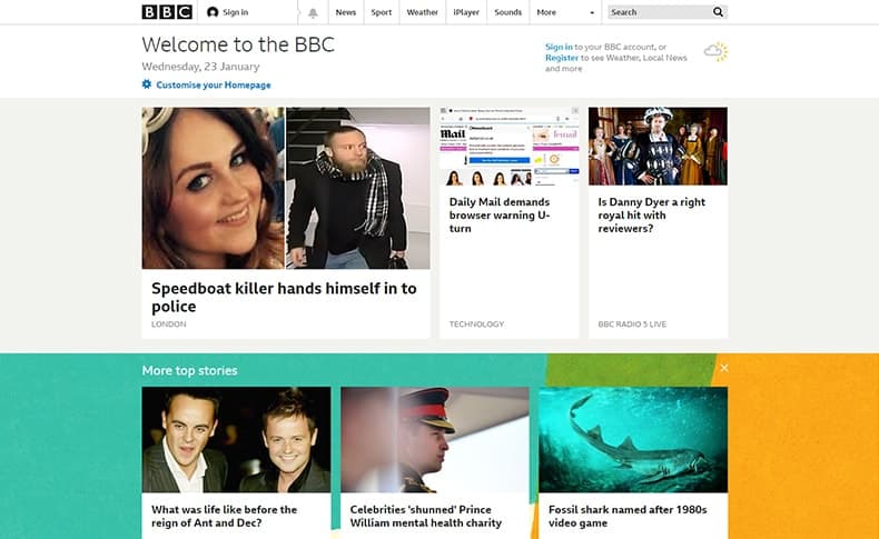
Look at the BBC website from 2009! Ten years ago, BBC website would change its theme colour every day, but you won’t see that these days any more. In 2019 BBC is pushing the minimalistic design. We can see more photos than text, which is in complete opposition to how it was before. This is evidently a sign of our times, and BBC recognised that internet users have a lower attention span and a picture or video can capture their attention more effectively than lines of text. This is one of the strongest examples in our 10 Year Challenge in web design.
Wikipedia – does not fix what is not broken
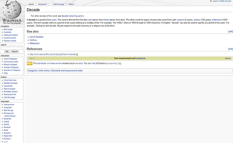
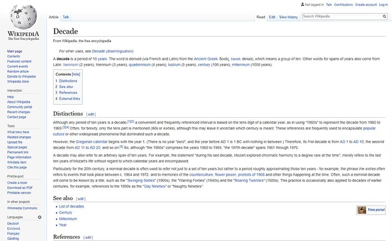
One must appreciate how little Wikipedia has changed over the years. The main grid remains the same with logo and menu on the left, login options at the top and the rest of the page filled in with definitions and descriptions. We can notice however subtle changes in the visual design. Flat design has definitely captured the attention of the people responsible for the layout, making it a tiny bit more modern following Google’s direction. On a side note, I think Wikipedia would benefit from introducing column layout. These days with screens that have high resolution it’s hard to read from left to the right of the screen without dropping the line once or twice when moving to the next row.
Reddit – ruffles some feathers
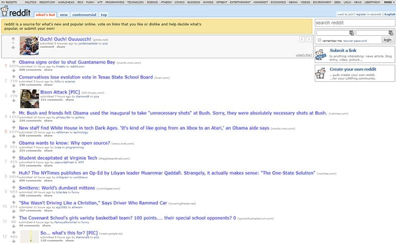
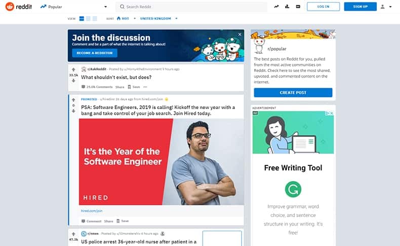
Highly criticised new design (beta) was first rolled out on 1st of April 2018. It introduced “Facebook-like” feed in the middle with an additional supportive column on the right and a significant amount (33%) of “white-space” surrounding it. The latter being especially prominent on high-resolution desktop screens. Notably, new design removed the blue header fonts that resembled Google Search results and replaced them with a black font (IBMPlexSans) that looks more like news portals.
According to Reddit’s CEO Steve Huffman, the new design aims mostly at new users: “Many of us evangelise Reddit and tell people how awesome it is … then when those new people decide to check out Reddit for the first time they’re greeted with dystopian Craigslist. We’d like to fix that.”
To mitigate some of the criticism, Reddit introduced three types of views that users can pick: Card, Classic, Compact. And, as of now (Jan 2019) the “Old-Redditers” can still switch back to the “old view” in their account preferences.
Reddit’s re-design approach heavily polarised the community and divided it into two camps: “Old-Redditers” and “New-Redditers” – who could’ve thought that you can find an analogy to the political situation in the United States in something like “10 Year Challenge in web design”…
eBay – follows in the footsteps of the best
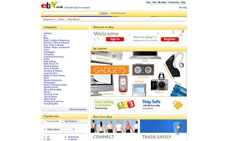
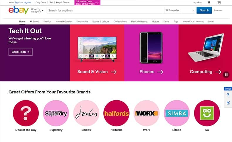
Ebay seems to be following Amazon’s suite by introducing a slider to it’s landing page. It’s big, it’s colourful, it grabs your attention. They learned how to use white (negative) space to their benefit, contrary to the home page from a decade ago. It was packed with categories (who really uses them on the home page…? That’s right. No one!), banners and images – it seemed very crowded. There’s also the case of the logo. I would argue the old one was more recognisable. Now we have this Google-like simple font – a popular trend in the past three years, but I think eBay’s logo used to be more distinct.
Twitter – the proper 10 year challenge in web design
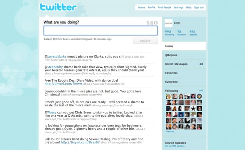
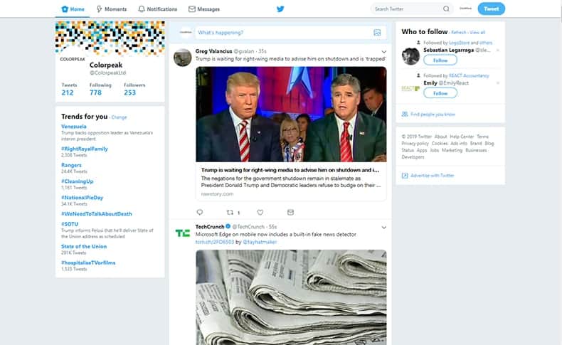
Complete transformation! That’s the first thing that comes to my mind when I compare the Twitter layout from ten years ago to its current version. Is this the winner of Colorpeak’s 10 Year Challenge in web design? Not quite.
This is yet another example of a website that takes simplicity and turns it into an advantage. A very intuitive layout that encourages you to simply tweet, re-tweet, and consume other tweets. Blue background has been replaced with white one, the logo became smaller and “What’s trending” panel has been added on the right-hand side of the feed. Twitter understands that the vast majority of its users access their feed from mobile phones, so it seems they design with a small screen and quick load time in mind. Then they follow with desktop design extending few elements a bit but refusing to include anything unnecessary. 5 stars when it comes to UX and UI design if you ask me!
10 Netflix – the winner dresses for success
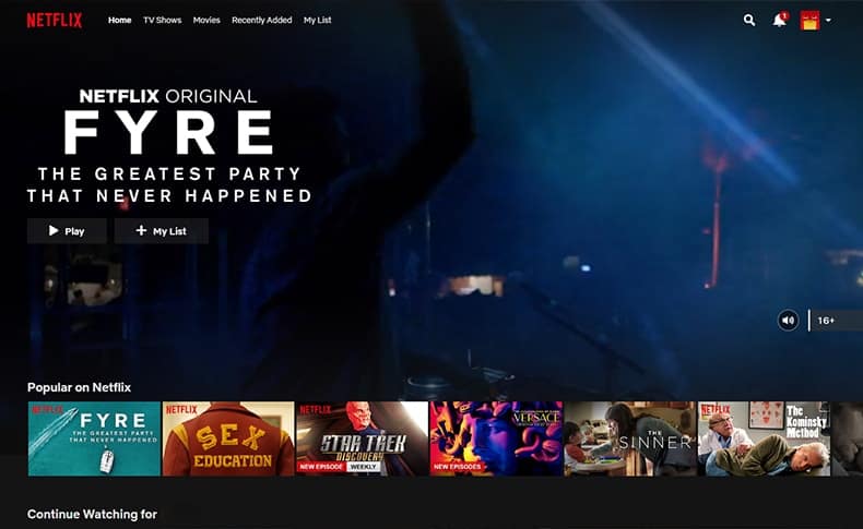
Last but not least is my favourite example which shows that sometimes one needs to start with MVP (“Minimum Viable Product”) to put the ball rolling and the success will come later. It is also the winner of our 10 Year Challenge competition! When you look at Netflix website from ten years ago, you will laugh. I did! But then we have to remember that back in the days there was no fast internet connection and renting (RENTING!) a movie through a website to be delivered to your home was shockingly innovative. Since then, Netflix has made a leap jump, and their navigation page that allows you to select movies is what created a binge-watching experience and trend. Whoever is behind Netflix Landing Page is an excellent web designer and developer team that understands how our brains work and how to trigger them to consume more and more content. Bravo!
This concludes our 10 Year Challange web design comparison. Of course, top ten visited websites in the UK change very often, so in a while, you may find this list outdated, but if you’re here in January 2019 these are the websites UK residents visit the most. We hope you enjoyed our take on #10YearChallange so go ahead and subscribe to our facebook, twitter and other social media accounts for more interesting articles from Colropeak team.

