CSS has been with us for over two decades, but its use properly kicked in 2003 when Jeffrey Zeldman published his book “Designing with Web Standards”. Since then the use of flash templates for web design started to slow down, and CSS became widely used.

What is flat design?
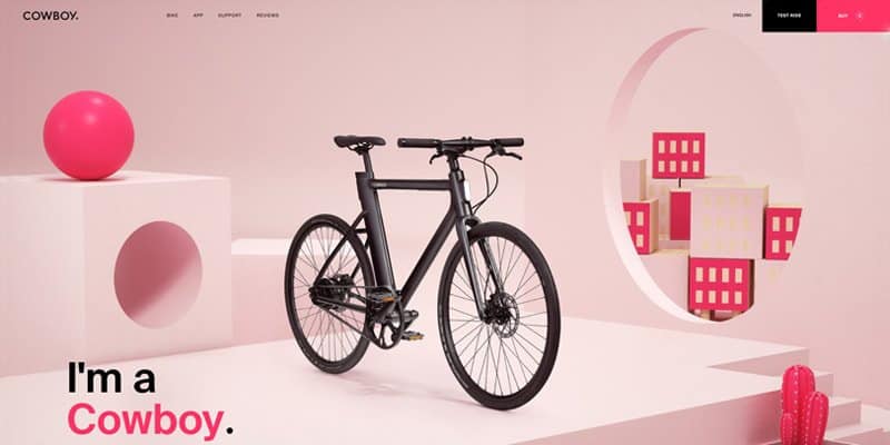
Flat design emphasises usability in its minimalistic approach toward the interface. It focuses on being clean and simple, emphasising open space, 2D illustrations, contrast and crisp edges. As a principal, the less stylistic elements seen as unnecessary clutter in web design, the better.
One can say that flat design goes back to the basics of web design in terms of being a functional tool. The focus shifts from how it looks to how well it works. Don’t get me wrong, the looks are still important and need to please the eye, but at the same time when your end goal is to implement flat, design it needs to equally be user-friendly.

Here are some basic principles of flat design:
- clean and simple
- two-dimensional illustrations and icons
- crisp edges
- use of contrast
- decluttered space
Depth in web design
On the other hand, the use of depth in web design has been equally popular. Designers who use it tend to say they like to “breathe life” into their work and add depth as a way to do it. By adding shadow, which is very popular to create a 3D perception, you can emphasise specific elements on the website and make them more realistic.
According to some, a real-looking interface can boost people’s interaction with the website which is always important when it comes to web design, as it must be pretty but more importantly, functional.
Some specific tools can be used to achieve depth in web design.
How can depth be achieved in web design?
- parallax backgrounds
- focal points and perspective
- subtle shading and lighting
- overlapping layers
- gaussian blur
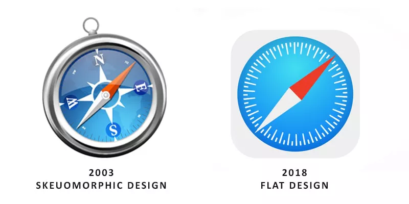
- skeuomorphism (interface objects that mimic their real-world counterparts in how they appear or how the user can interact with them – definition by Interaction Design)
Skeuomorphism became popular thanks to Apple. Steve Jobs was always the one who emphasised that people should use devices thanks to intuition and should not have to read manuals to enjoy the technology. But after a few years, this trend seems to be overused, and even Apple followed the Windows approach and introduced flat design in their devices.

These days everything seems to be mixing, and although we see the flat design in the lead, it has some depth elements incorporated into it like subtle shadows and micro-animations. It is the best of two worlds combined for better visuals and user-experience. That’s a win-win if you ask me.

