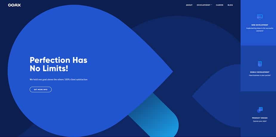
When designing a website, one can no longer think only about the visuals. These days, every line of code needs to have a purpose. Good web design is agile and scalable, so when your business decides to move forward, your website is ready to do the same. It should easily introduce e-commerce features, tracking options, and be ready for some quick updates. A website in 2019 should also be prepared for marketing campaigns for when you need to promote your business, test customers’ response or understand what engages them.
Web design and marketing trends for upcoming year 2019
- Mobile speed
- Minimalism
- Micro-Interactions and Motion
- Content
- Flat Design vs Depth
- Simple symmetrical grid or Broken Grid
- One-pagers
- Artificial Intelligence Support
1. Mobile Speed
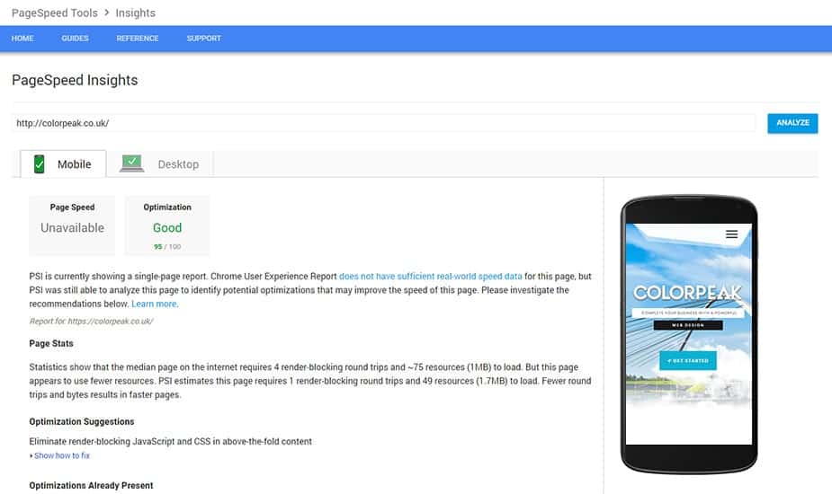
People are quite impatient when it comes to consuming content.
2. Minimalism in web design
This trend keeps coming and going since flat design became ‘the thing’ in 2013. However, considering that the loading speed will be the most important principle, we predict that minimalism in web design will become an even stronger trend.
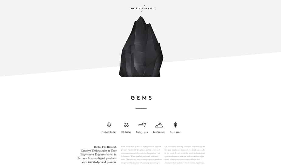
Regarding visual design, there are many concepts that can be utilised to keep it simple. For one, we can effectively use the blank space. It is a powerful tool that can help emphasise the most critical part of websites that tend to be more colourful these days. Shapes, for instance, can create more complicated patterns that are lightweight in comparison to large background graphics. In principle, a flat design should create the illusion of 3 dimensions with the minimum use of stylistic elements. You can achieve that by using drop shadows, gradients or textures effectively, all to serve a better user experience. In regards to marketing trends we will have to find balance between keeping it simple visually and being able to present all the relevant information.
Visit website – weaintplastic.com
3. Micro-interactions
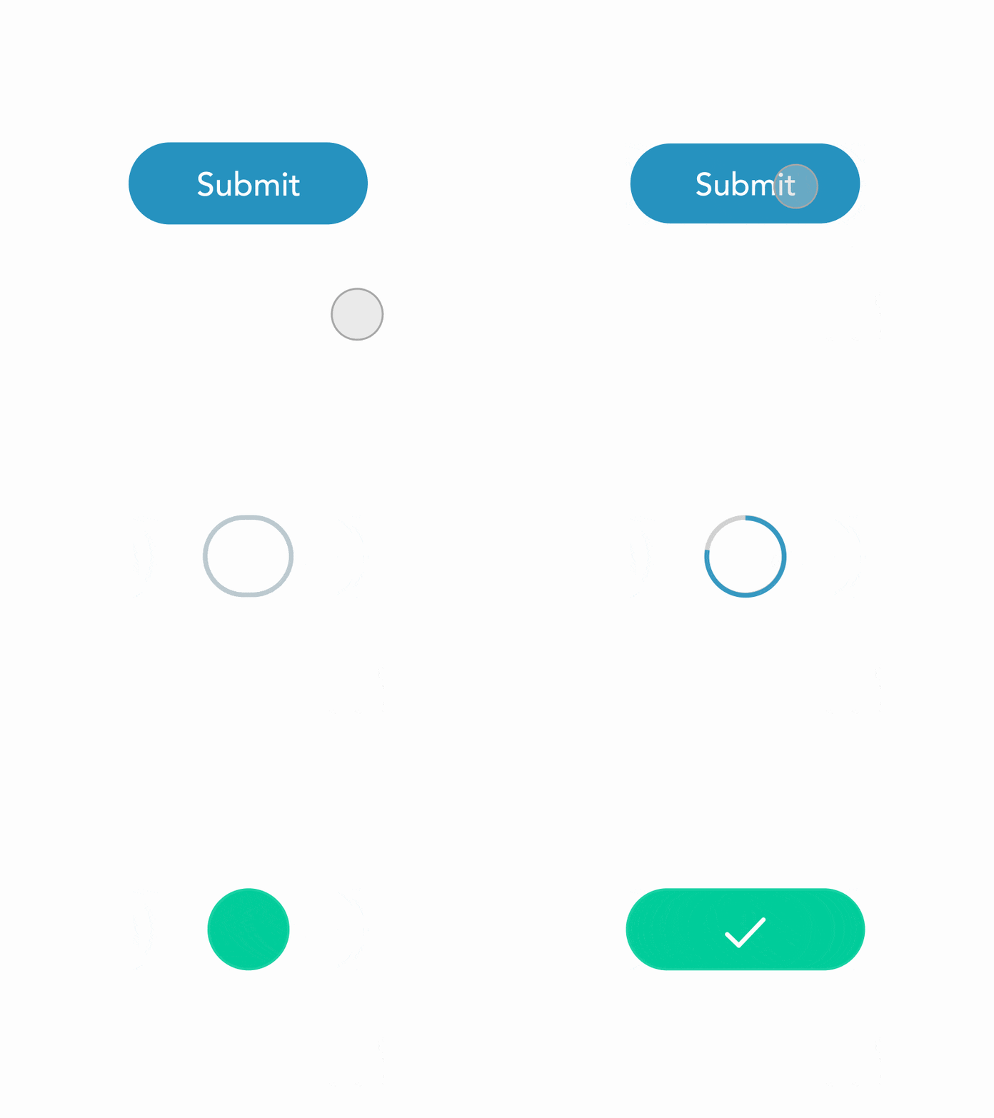
Animations are very welcome in web design, but there is a catch. Well, not a catch literally, but an advice to keep in mind. In 2019, it’s all about micro-interactions and subtle motion. Large animations loading in the background will not only slow down your page, and we already learned it’s all about the speed these days, but are simply a design faux-pas! Micro animations should point the users to where you want them to click, they should engage them. A good design will allow you to direct the user’s attention to important information. An animation that catches your attention is also good from promotion perspective so it fits well within marketing trends treshold for 2019.
4. Content
The point of every web design is to inform your customers about your product or service. When designing the content to be included, make sure that all the elements serve the primary purpose of being informative but not overwhelming to the reader. We are seeing across the web that often the content on pages is too scattered which, although aesthetically pleasing, may be a nuisance for your website visitor.
As Robert Browning once wrote, “less is more“. This principle is not only already trending in infographics, but also gave a direction to the flat design that kicked in 2013 and it will become more popular than ever in 2019. This is because simplicity helps the user to understand the essence of the message without losing time trying to find particular information.
On the marketing side, you should be conscious of how your content will improve your SEO ranking. A well-designed content will make your website more visible to search engines and, as a result, you will gain more visitors. Contend is the king according to marketing trends.
5. Flat design vs depth
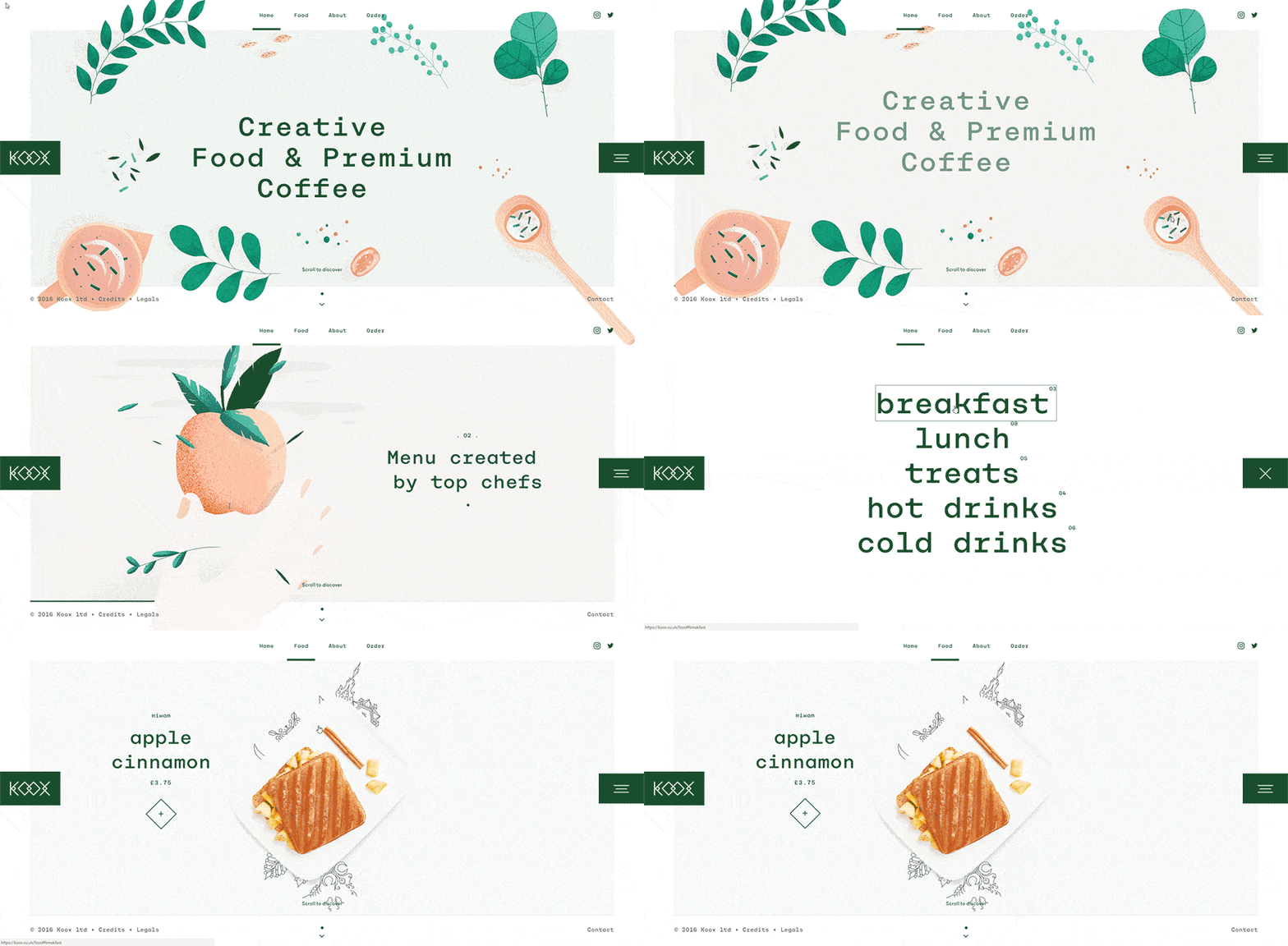
There seem to be as many opinions as web designers on this subject. Although most web designers tend to agree that flat design will continue to lead, we are seeing more and more websites showing a bit of depth. This seems to be connected to the micro-interactions trend that will be massive in 2019 and which we will talk about later on in this article. A merger between the two worlds of flat design that has a slight 3D dimension revealed on hovering or whenever the customer moves around the website is what will become the new fancy thing to achieve. Only time will tell if we were right.
6. Symmetrical web design or asymmetrical grid – that is the question!
There is no answer to this question, though! It seems to be a preference. One thing is for sure, a design grid is a must and these days too long blocks of text will for sure discourage your reader from learning what you have to offer, but there seems to be an even split in the design world wheatear the design should be symmetrical or not. At Colorpeak, we would say both, as this will make your website more pleasing to a viewer’s eye and appealing to a broader audience. In other words, we would focus on symmetrical design and break it with something fancy and unpredictable every so often like an asymmetrical section divider, repeating and irregular patterns or by using typography in a creative way.
 “Asymmetry can be one of the most impactful concepts in your design toolkit. It is an attention-grabbing technique that is interesting and thought-provoking.” – DesignShack
7. One-page web design
Although from the SEO perspective we would strongly recommend having more than one page on your website (for optimal keywords distribution), if you need your website to become a ‘business card’ there is no better way than having a one-page site. And to be honest, an effective agency could even do some magic and promote you to reach the first page of Google either way. Back to the single-page design, though! No one will deny that if you want to optimise for mobile speed, a one-page design is better than a traditional website. Also, if your business model relies on personal interaction, a single page web design is probably the best choice.
There are other and more technical benefits to one-page websites. For one, they are cheaper. A small website requires less maintenance than a large one. The simple navigation improves the user experience. And last but not least, a one-page website can be static (saved in HTML, does not require a MySQL database) so it is arguably more secure.
8. Artificial intelligence Support
The use of AI, especially in data analysis, is becoming more and more important with each year. When it comes to marketing data collection, automation is invaluable not only because it allows you to understand your audience but also because there is so much data to analyse that without self-learning robots it would be impossible to draw any conclusions. Google analytics is no longer a good addition to a website – it’s really a basic requirement.
Conclusion
Even though 2019 is still ahead of us, nothing is stopping us from trying those web design and marketing trends now. A good trend will stick around for a few years, especially when it is dictated by such big influencers like Google and their algorithm updates. As the industry changes, so do the trends and this time they are all about speed, simplicity, and micro-interactions for the most part, both in the design and marketing areas.

